Case Study: A/B Testing the Sweepstakes Sign-Up Flow
I led the research, design, and testing of the sign-up experience, using A/B testing to determine which approach drove higher conversions and better long-term engagement.
Role
Product Design Lead
Timeline
4 weeks
Impact
Total list growth from campaign: +43% over 3 weeks

Overview
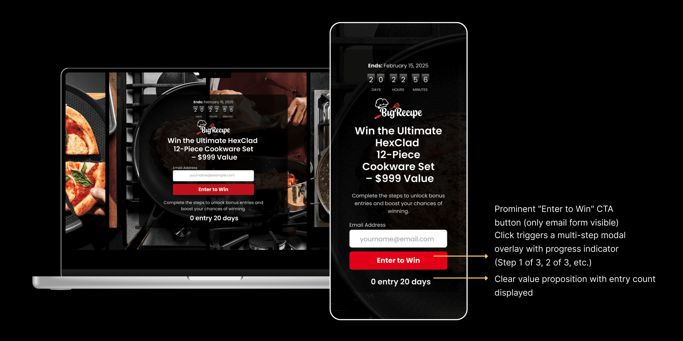
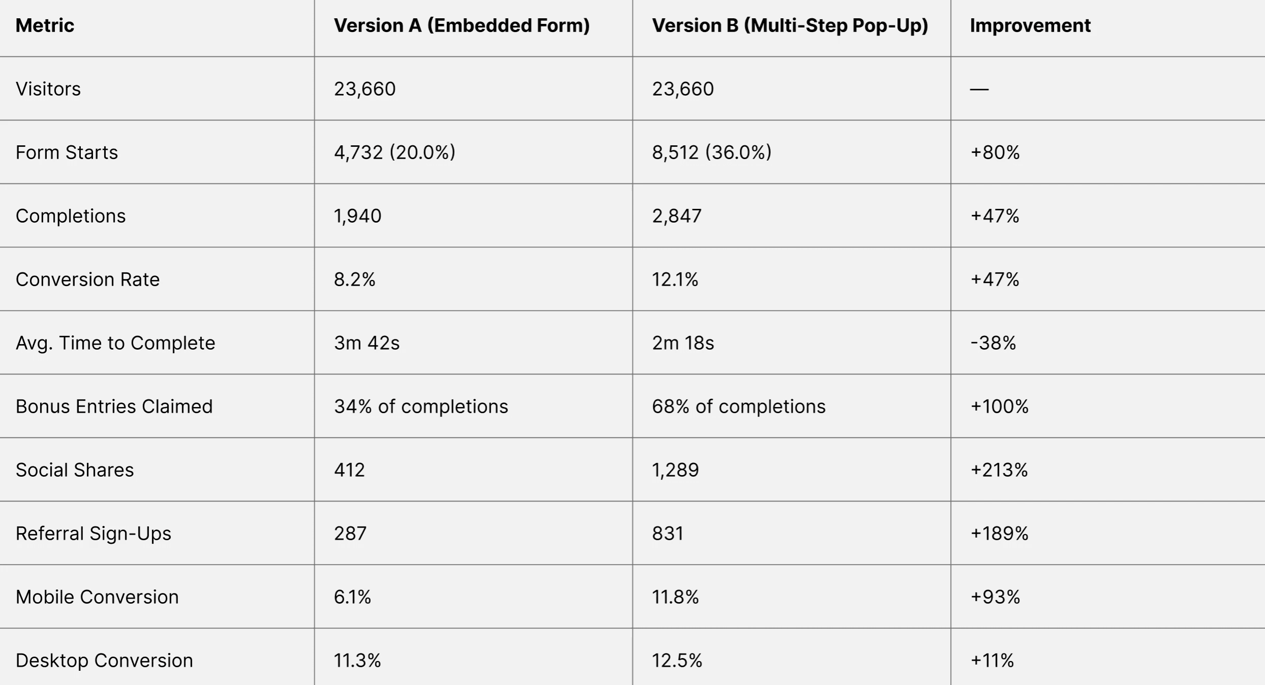
Big Recipe conducted an A/B test to optimize newsletter sign-ups through a sweepstakes campaign offering a HexClad 12-Piece Cookware Set valued at $999. The test compared an embedded landing page form against a multi-step pop-up modal. The multi-step pop-up achieved a 47% higher conversion rate, increasing sign-ups from 8.2% to 12.1% and generating 2,847 additional qualified leads over the 21-day test period.
My Role: Product Designer
Project Duration: 7day design (ideation → handoff) | 21 days test
Team: Product Manager, Data Analyst, 2 Engineers, Marketing Lead
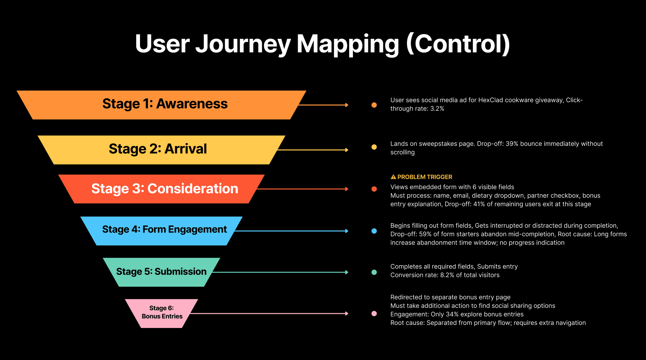
Problem Statement
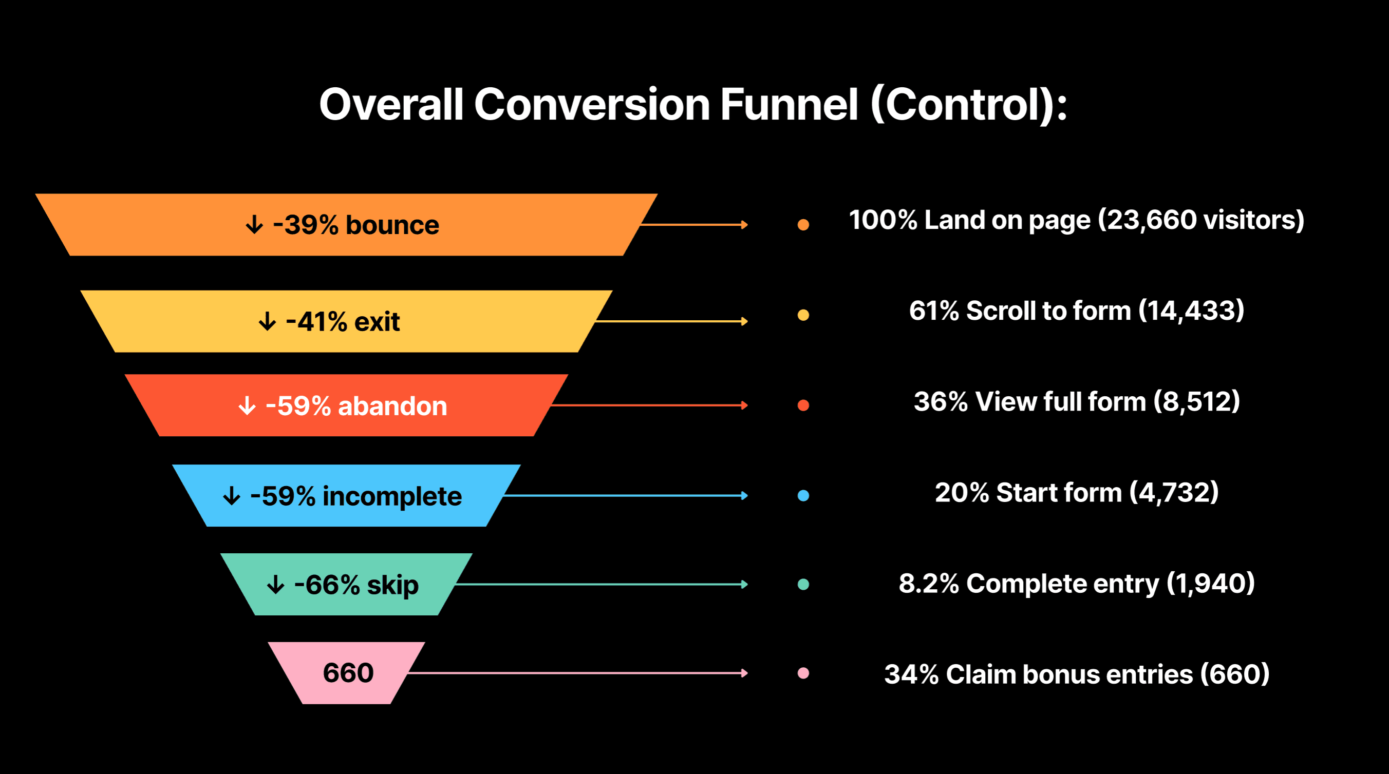
Big Recipe's existing sweepstakes landing pages were experiencing high bounce rates (61%) and poor form completion rates (8.2%) despite strong initial traffic from paid campaigns. User behavior analytics revealed that 20% of visitors started filling out the form, but only 41% of those who started actually completed it, a completion rate significantly below industry benchmarks of 60-70%.
Core Issues Identified: | Business Impact: |
|---|---|
|
|
|
|
|
|
|
|
|
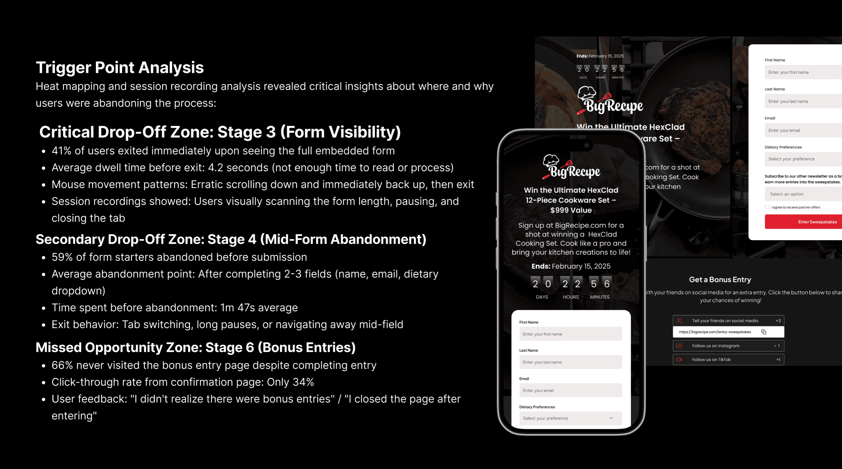
The Decision-Making Process
Based on these findings, the team held a design brainstorm to address the core question:
"How do we reduce initial friction while maintaining data collection requirements?"
Option 1: | Option 2: | Option 3: |
|---|---|---|
Pros: Simplest solution, proven to increase conversions | Pros: Increases initial value proposition visibility | Pros: Addresses all three drop-off zones simultaneously; maintains context; proven in SaaS onboarding; mobile-friendly |
Cons: Marketing team required dietary data for personalization; partner opt-ins were contractual obligations; fewer data points reduced email segmentation capabilities | Cons: Adds complexity to the critical first impression; could overwhelm users before they commit | Cons: Risk of modal abandonment; requires careful progress indication; more complex implementation |
Decision: Rejected—would compromise campaign objectives | Decision: Rejected—would worsen cognitive overload at entry point | Decision: Selected as test variant |
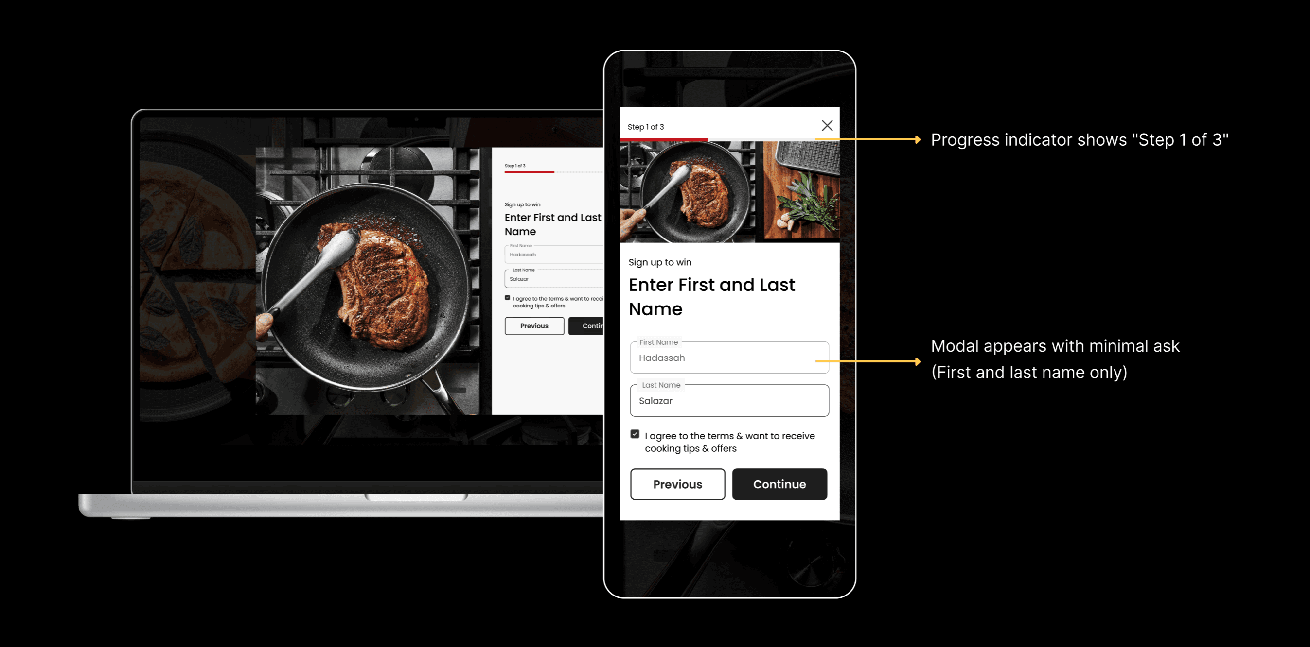
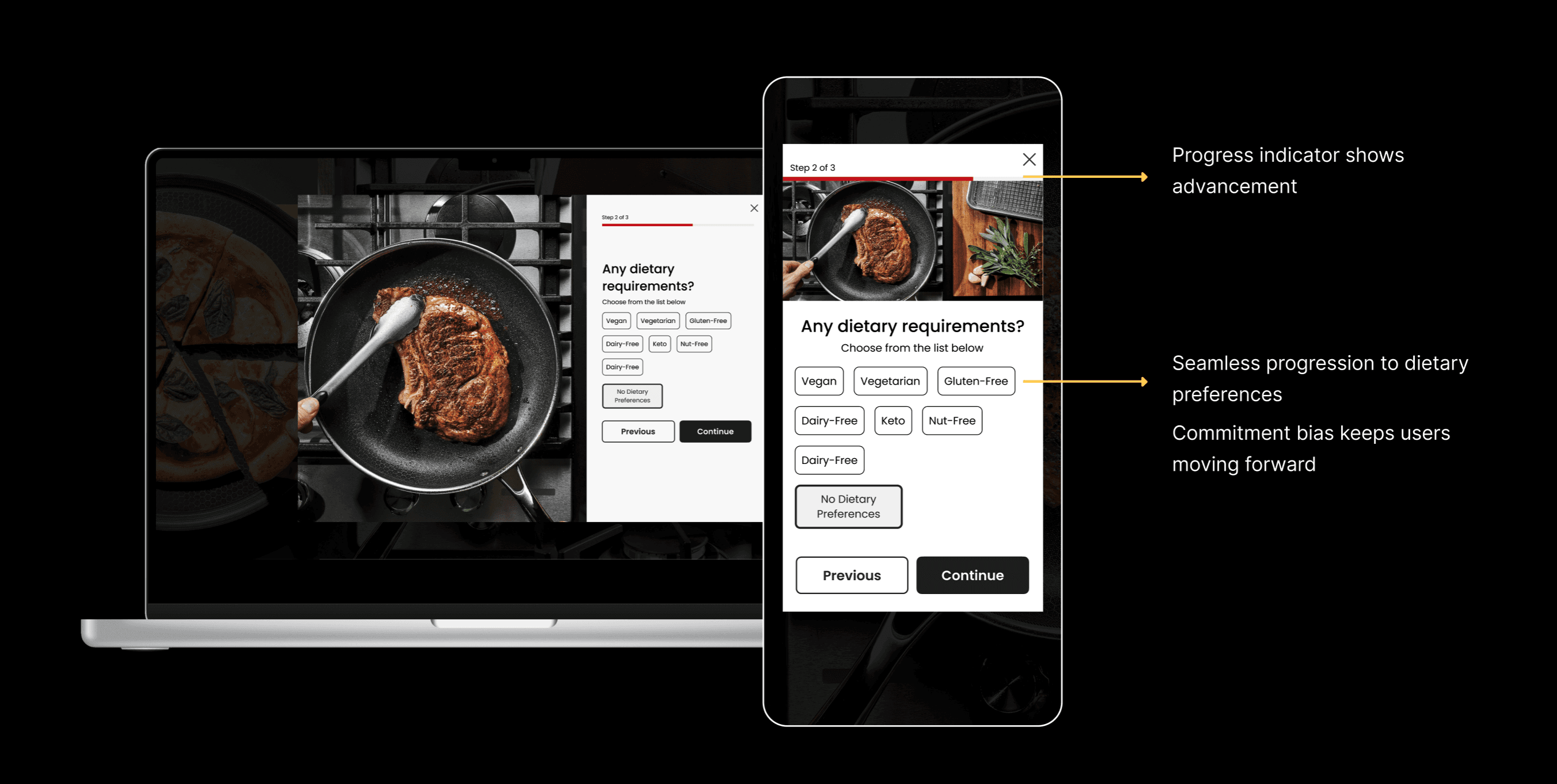
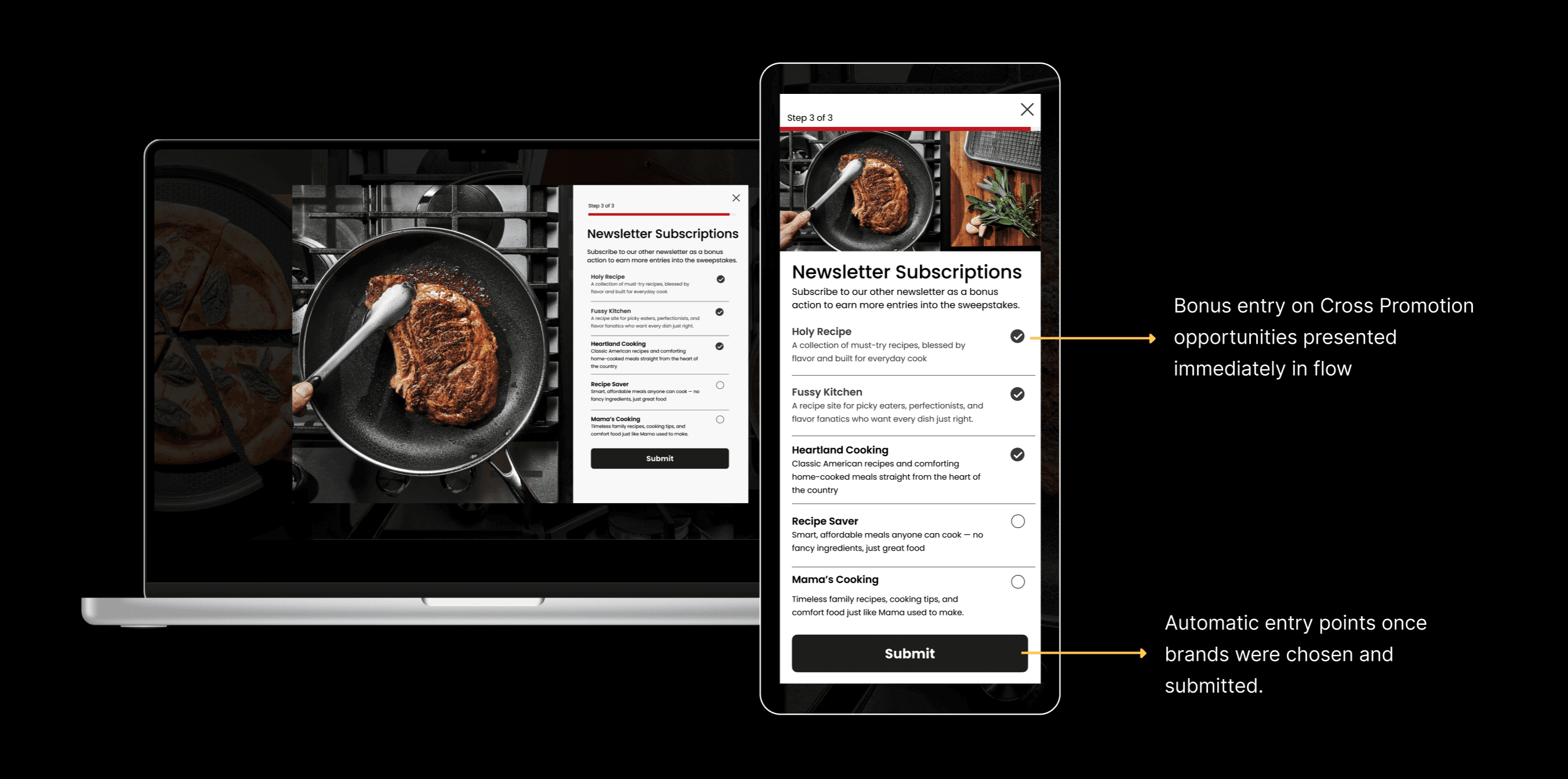
Hypothesis
IF we hide the form complexity behind an inviting CTA and break the entry process into 3 progressive steps (2 fields → 2 fields → bonus actions),
THEN we will:
Reduce Stage 3 exits by 50% (from 41% to ~20%) by eliminating form intimidation
Increase form start rate by 60% (from 20% to ~32%) by lowering the perceived commitment
Decrease mid-form abandonment by 40% (from 59% to ~35%) through micro-commitment momentum
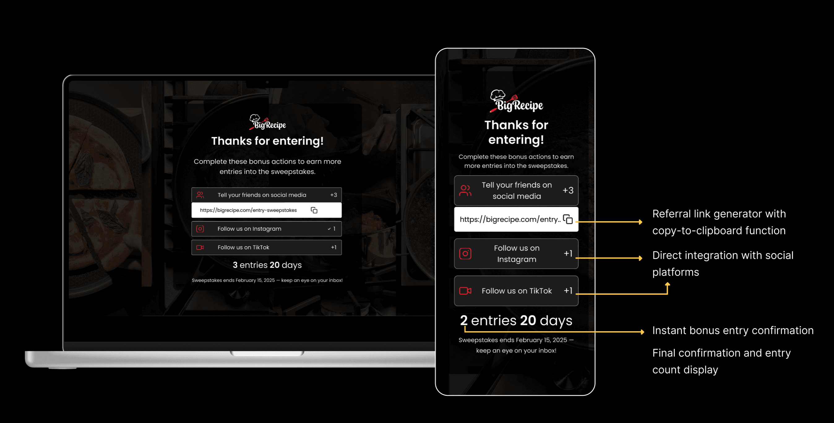
Increase bonus entry engagement by 100% (from 34% to 68%) by integrating it into the core flow
Key Metrics & Results
Recommendations & Next Steps
Implement Version B Permanently
Roll out the multi-step pop-up modal as the default experience for all future sweepstakes and lead generation campaigns.
Further Optimization Opportunities
Test trigger timing: Experiment with exit-intent triggers vs. immediate pop-up vs. timed delays
Gamification elements: Add a prize preview or entry counter animation
Personalization: Show different partner offers based on dietary selections
A/B test Step 3: Test whether bonus entries should be Step 3 vs. a post-submission page
Mobile-first design: Create a mobile-specific variant with even larger touch targets
Conclusion
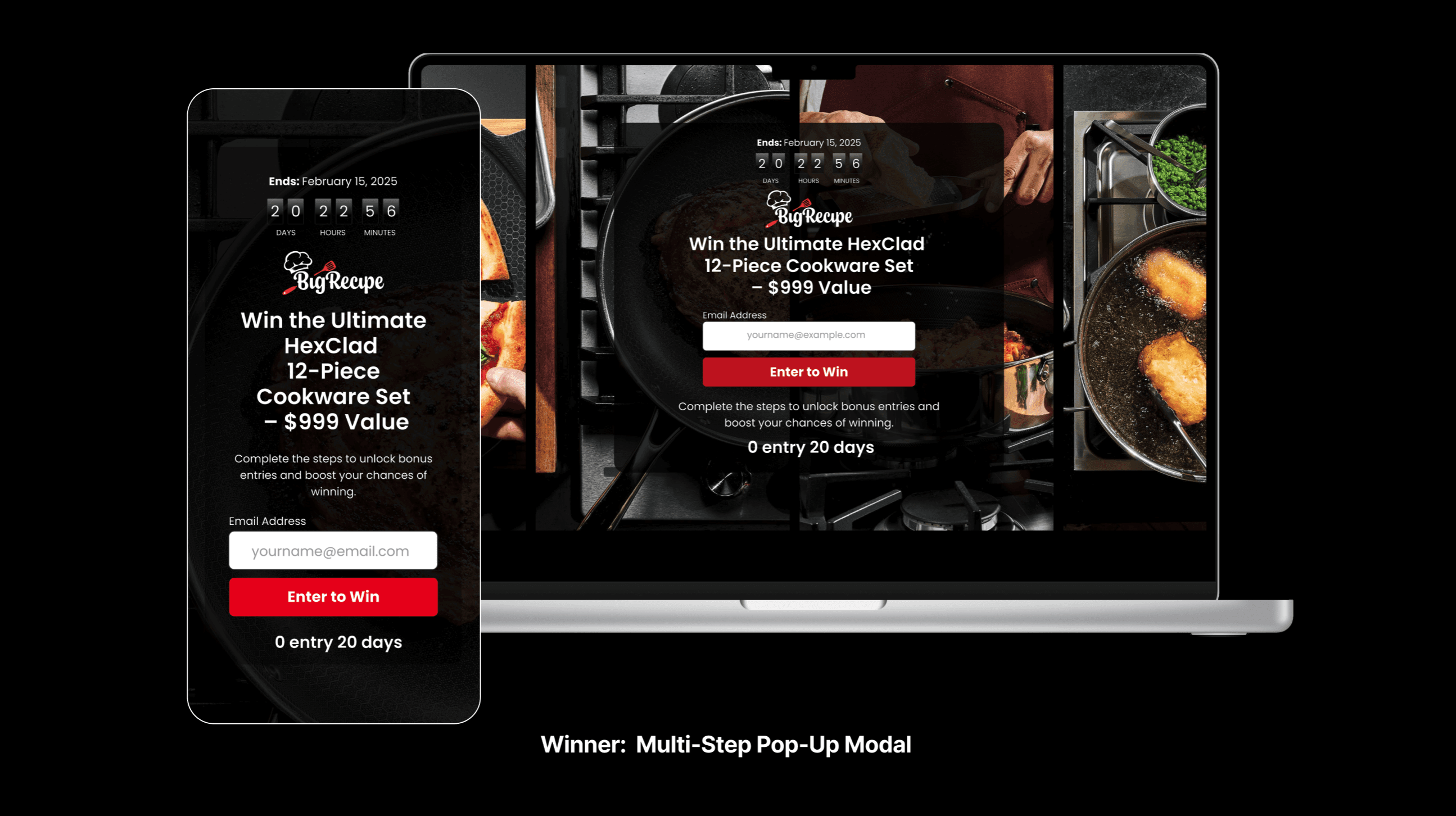
The multi-step pop-up modal significantly outperformed the embedded landing page form, delivering a 47% increase in conversion rate and 907 additional newsletter subscribers. By reducing cognitive load, maintaining user focus, and seamlessly integrating bonus entry opportunities, Version B created a superior user experience that drove both immediate conversions and viral growth.
The success of this approach demonstrates the power of progressive disclosure and strategic flow design in optimizing complex forms. For Big Recipe, this translates to a more cost-effective acquisition strategy and a larger, more engaged audience for future campaigns.
Other projects

AI Writing Assistant (CMS Internal Tool)
Integrated an AI writing feature into our CMS tool to help editors and writers create more engaging, polished, and accessible content, all while preserving speed and creativity.

Morning Brew - Subscription experience
This project is to redesign the subscription process to increase the conversion rate to registered users by 70%. I've work with UXR to help me identify new opportunities for product development based on user needs and behaviors.

Homepage Redesign
Scaling a Unified, High-Performing Homepage Template Across Eight Trusted Media Brands

Ticket-Assigning Flow
Partnered with Bizzabo’s B2B SaaS product team to design a tailored solution for CDO Magazine’s ticketing flow, improving usability, reducing error rates, and enabling tickets to be assigned 60% faster.

AI Alternative Diet Feature
AI Alternative Diet Recipe Feature to generate alternative recipes or substitute ingredients for popular dietary considerations. These options allow users to modify recipes for dietary needs by swapping meat-based dishes for plant-based or healthier alternatives and then swapping them back.

GLP-1 Meal Prep Platform
Mealcycle: Designing a GLP-1 Patient Experience from First Click to Ongoing Care

Taste of Home - Recipe Product Page
This project was to redesign a recipe page to optimize it for search engines, increase revenue from affiliate links, and create a clean, user-friendly layout.

CareNest self-service dashboard to manage listings, view insights, and optimize their visibility through AI feedback
Easy-to-use SaaS dashboard to manage listings, analytics, and inquiries, helping them grow visibility and optimize their business through AI insights.