Homepage Redesign
Scaling a Unified, High-Performing Homepage Template Across Eight Trusted Media Brands
Role
Product Design Lead
Timeline
3 months
Impact
A system that drives SEO, engagement, and revenue

Overview
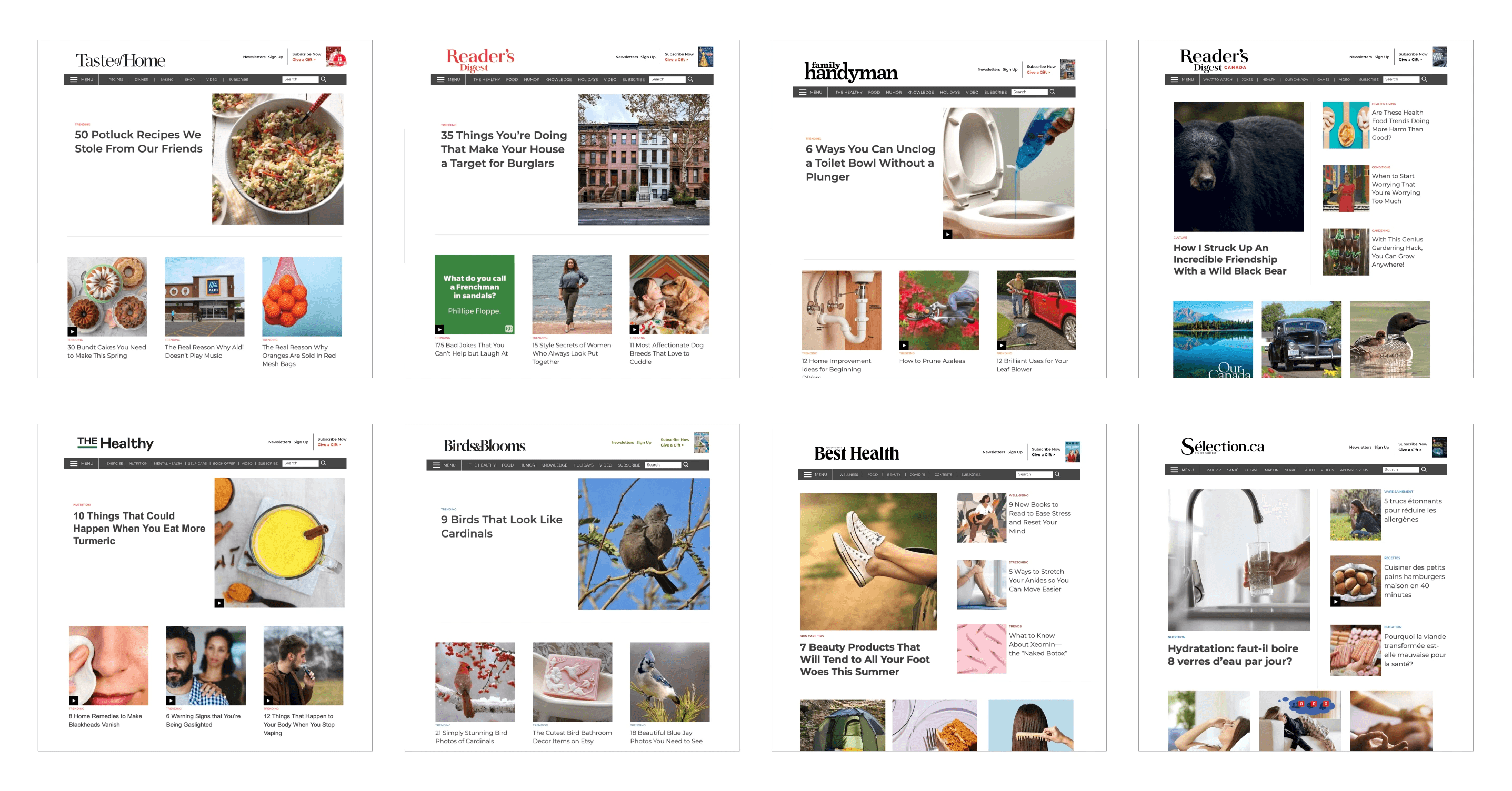
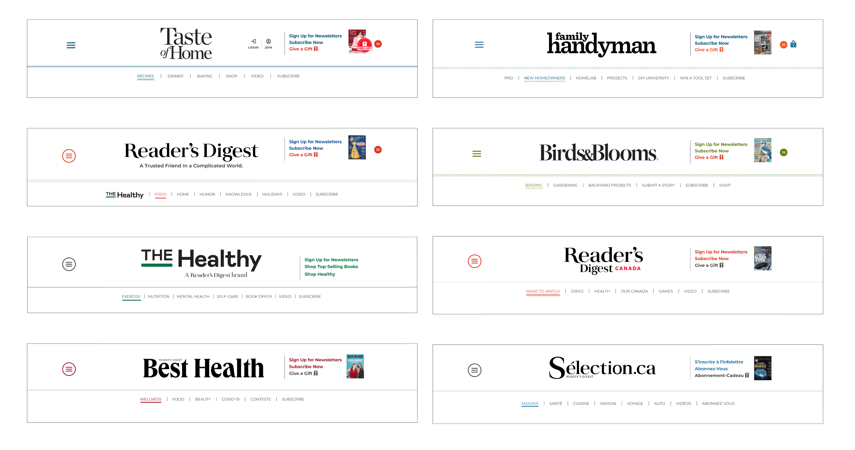
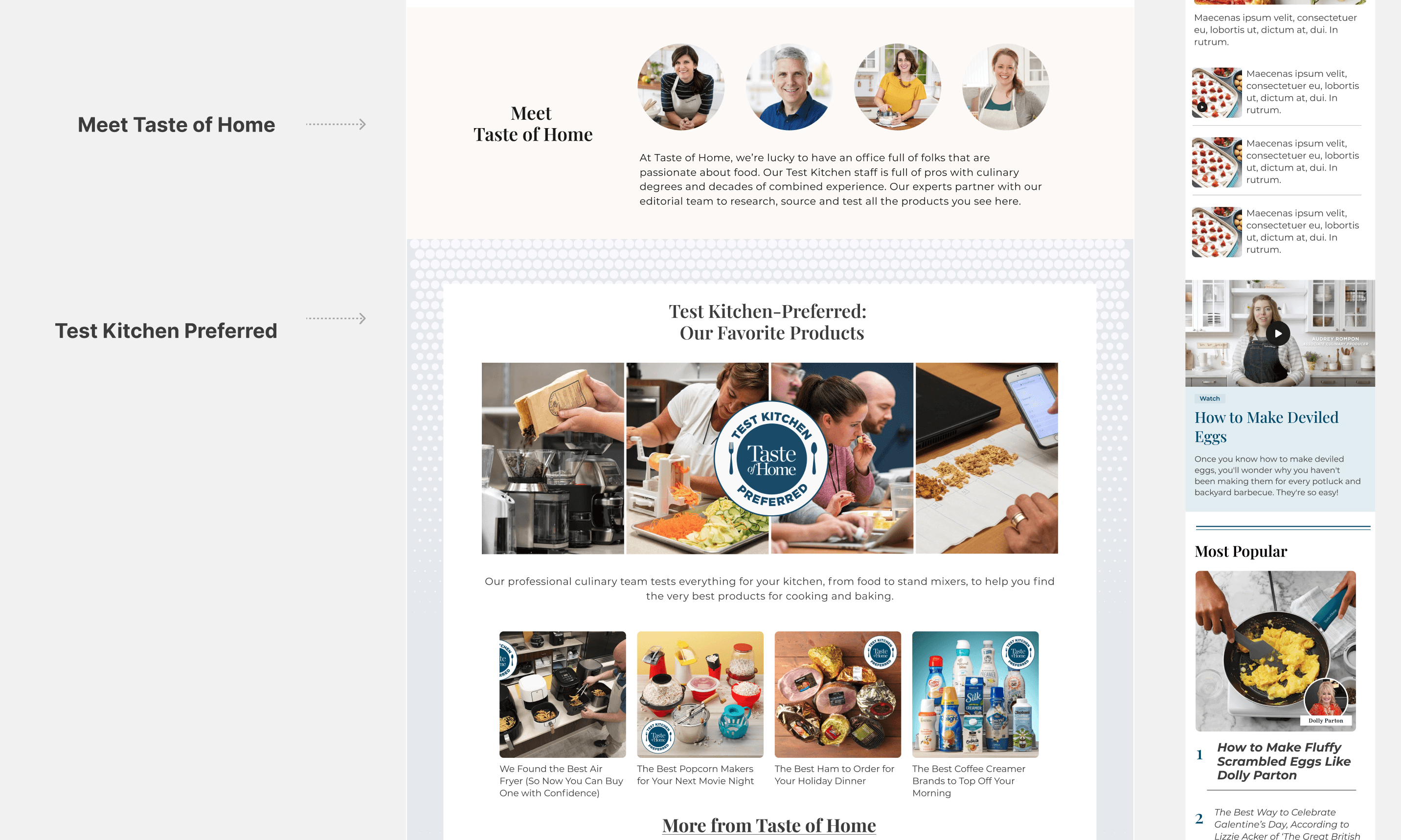
Trusted Media Brands (TMB) manages a diverse portfolio, including Taste of Home, Reader’s Digest, Family Handyman, The Healthy, Birds & Blooms, Best Health, Reader’s Digest Canada, and Sélection.ca.
All eight brands used a common homepage template, which exhibited similar issues across the board.
UX LEAD ROLE/WHAT I DID
• Competitive research
• UX audit
• System Consideration Audit
• Gathering stakeholder requirements and wishlist
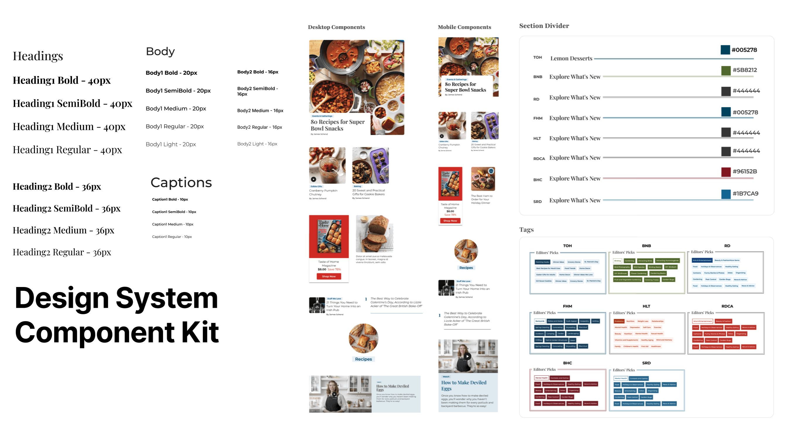
• Component building blocks
• Design System
• Engineering handoff
Goals
Redesign Objectives
Create a scalable homepage template that works across eight brands
Easy to reskin - can quickly update visual elements like colors, fonts, images, and graphics without changing the core structure, functionality, or underlying code.
Improve UX through modern layout, visual hierarchy, and intuitive content flow
Strengthen SEO and keyword placement
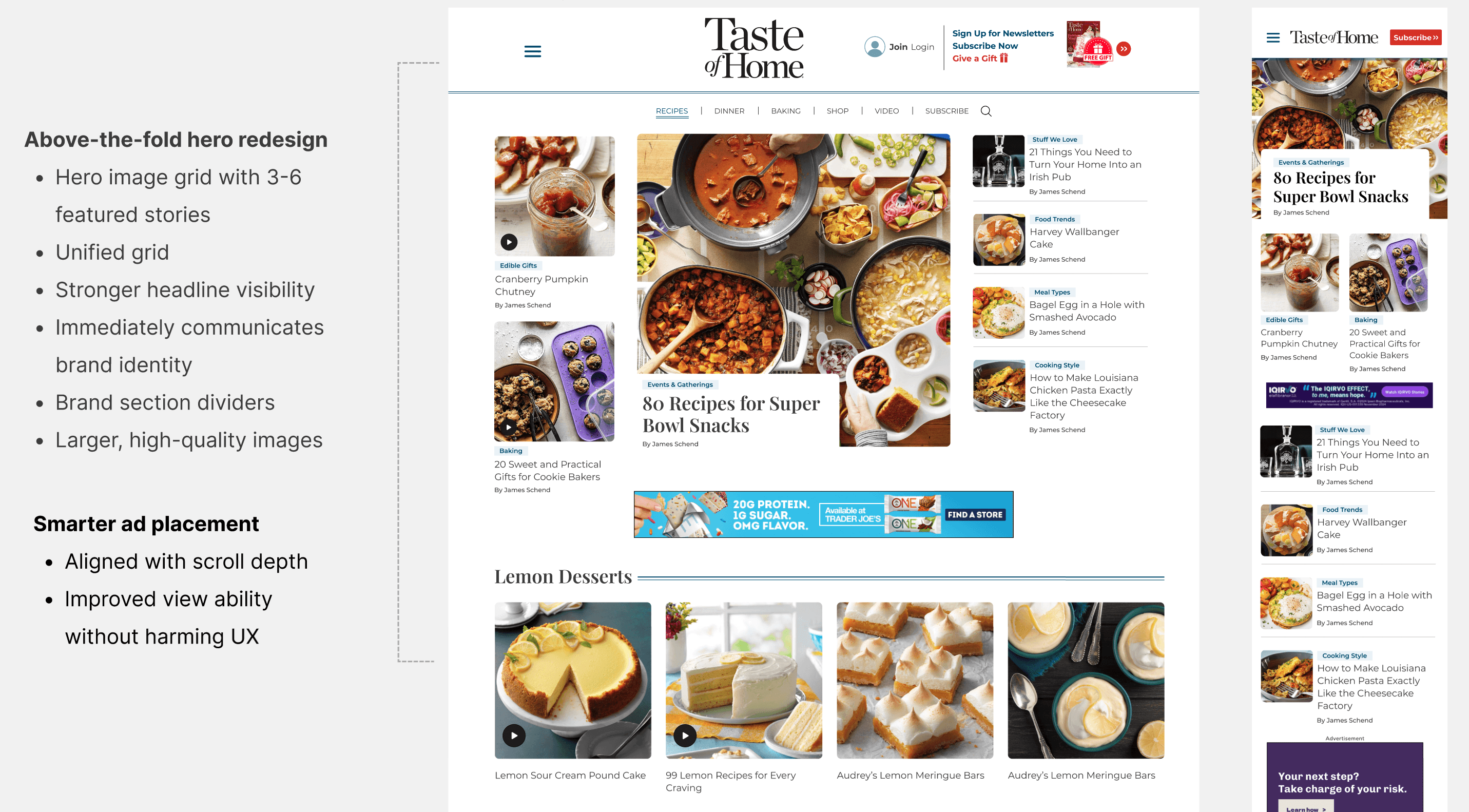
Improve above-the-fold performance with larger imagery and stronger headlines
Increase engagement, clicks, and scroll depth
Monetization opportunity
Stakeholder Requirements
Editors | Monetization | SEO | Product |
|---|---|---|---|
|
|
|
|
Design & System Considerations
• Mobile-First Experience
• Limited & Flexible Typography (2–3 Font Styles) Ensure the design could easily adapt to: food content, health content, humor, DIY, wildlife, women’s lifestyle,Canadian markets
• Think about using hero images that complement all kinds of content, not limited to food.
• Clear, Scalable Font Size System (3–4 Levels)
• Character Count Rules for Consistency (Title Line Count, Card Description Count,Truncation Standards)
• Shoppable
• Hover states
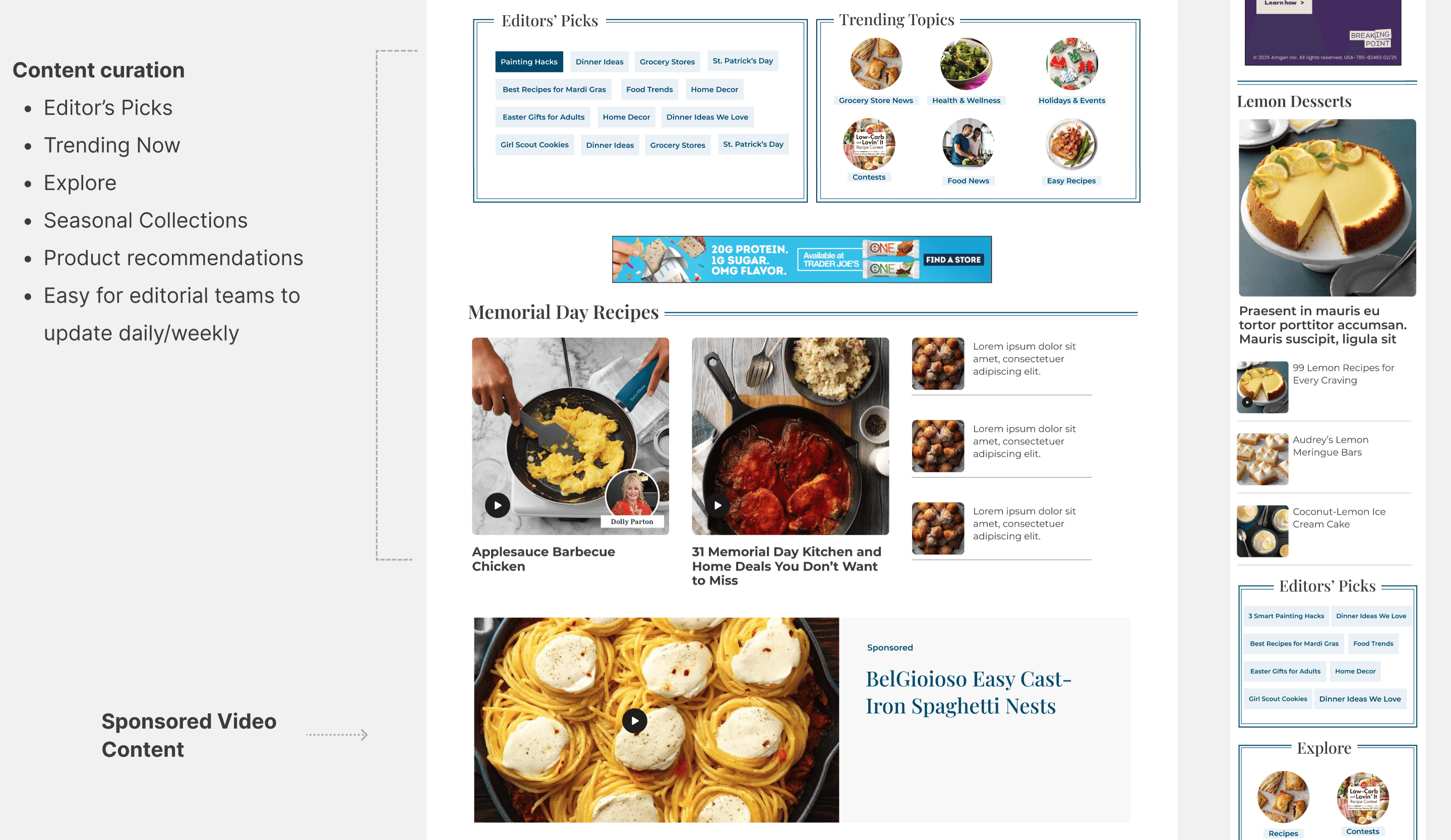
• Clear Taxonomy - Tags, Internal linkings
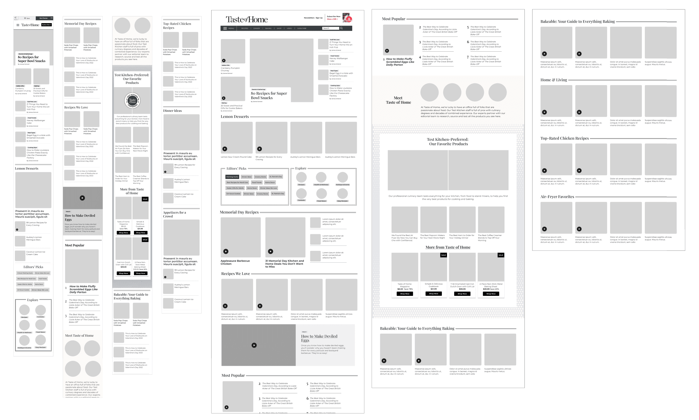
Process & Approach
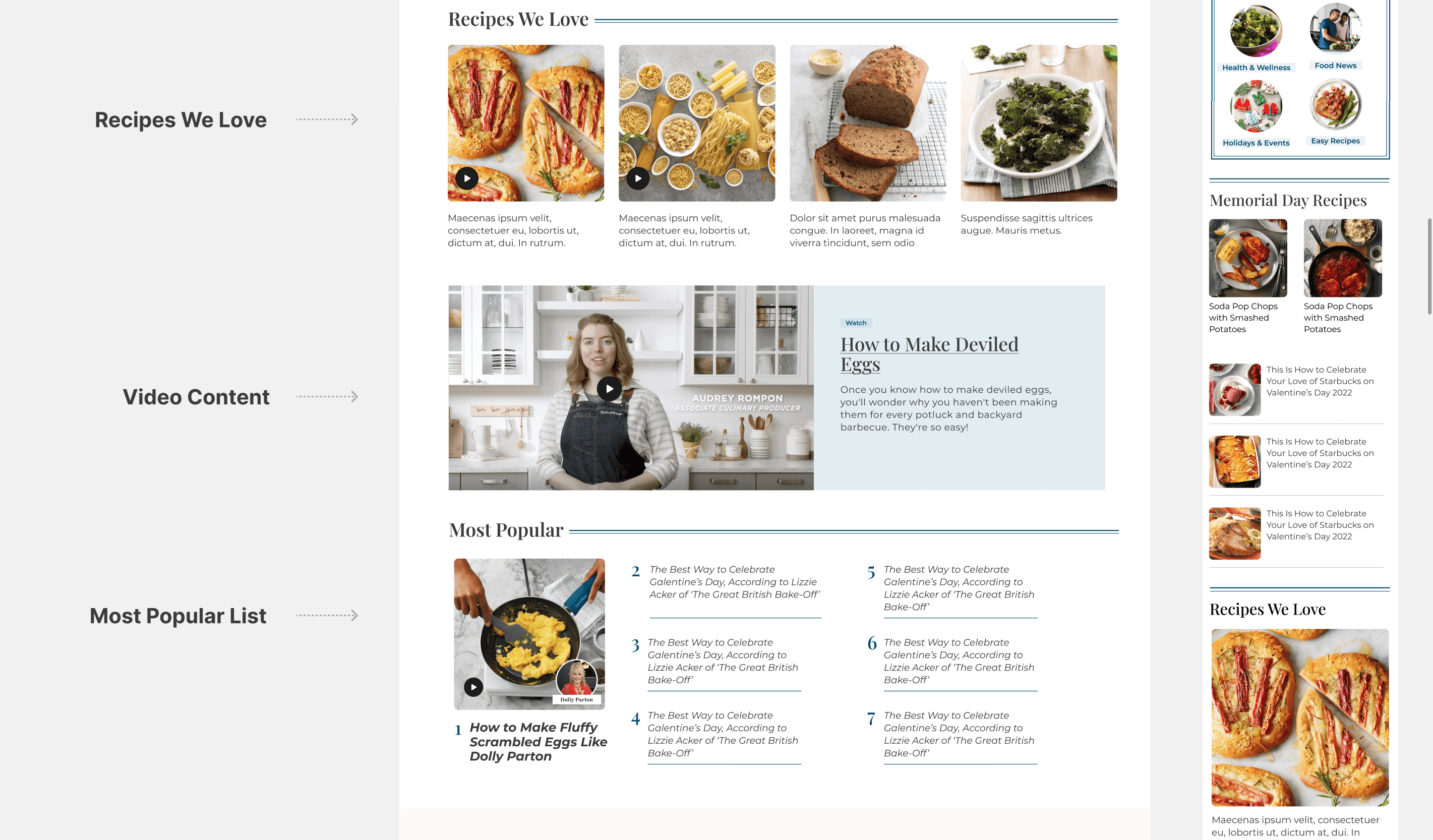
Modular Component
Combining Together
Template
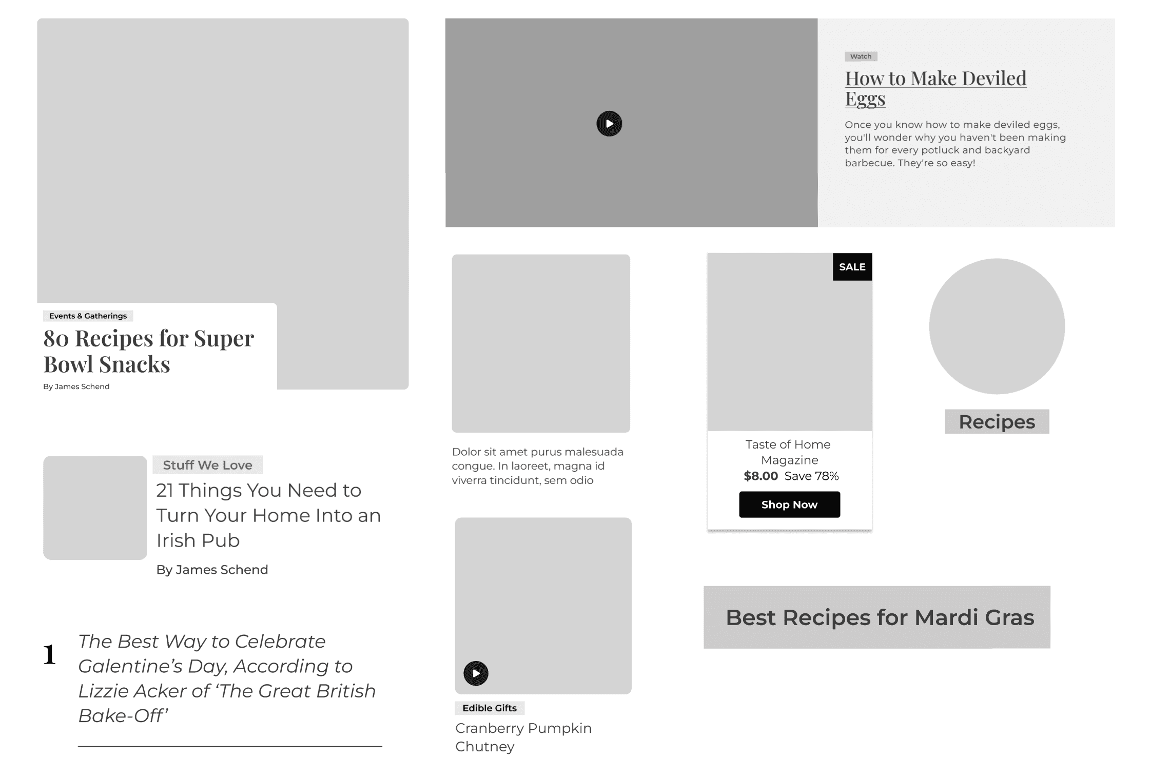
Headers
This redesign delivered:
A consistent and modern homepage experience
Above the fold gives users immediate value and offers multiple entry points into content
A system that drives SEO, engagement, and revenue
Editorial flexibility across multiple brands and markets
A future-proof modular component framework
This project demonstrates my ability to reimagine legacy templates, unify multi-brand systems, and drive impact through the intersection of UX, SEO, editorial, and product design.
Other projects

AI Writing Assistant (CMS Internal Tool)
Integrated an AI writing feature into our CMS tool to help editors and writers create more engaging, polished, and accessible content, all while preserving speed and creativity.

Morning Brew - Subscription experience
This project is to redesign the subscription process to increase the conversion rate to registered users by 70%. I've work with UXR to help me identify new opportunities for product development based on user needs and behaviors.

Ticket-Assigning Flow
Partnered with Bizzabo’s B2B SaaS product team to design a tailored solution for CDO Magazine’s ticketing flow, improving usability, reducing error rates, and enabling tickets to be assigned 60% faster.

AI Alternative Diet Feature
AI Alternative Diet Recipe Feature to generate alternative recipes or substitute ingredients for popular dietary considerations. These options allow users to modify recipes for dietary needs by swapping meat-based dishes for plant-based or healthier alternatives and then swapping them back.

GLP-1 Meal Prep Platform
Mealcycle: Designing a GLP-1 Patient Experience from First Click to Ongoing Care

Taste of Home - Recipe Product Page
This project was to redesign a recipe page to optimize it for search engines, increase revenue from affiliate links, and create a clean, user-friendly layout.

Case Study: A/B Testing the Sweepstakes Sign-Up Flow
I led the research, design, and testing of the sign-up experience, using A/B testing to determine which approach drove higher conversions and better long-term engagement.

CareNest self-service dashboard to manage listings, view insights, and optimize their visibility through AI feedback
Easy-to-use SaaS dashboard to manage listings, analytics, and inquiries, helping them grow visibility and optimize their business through AI insights.